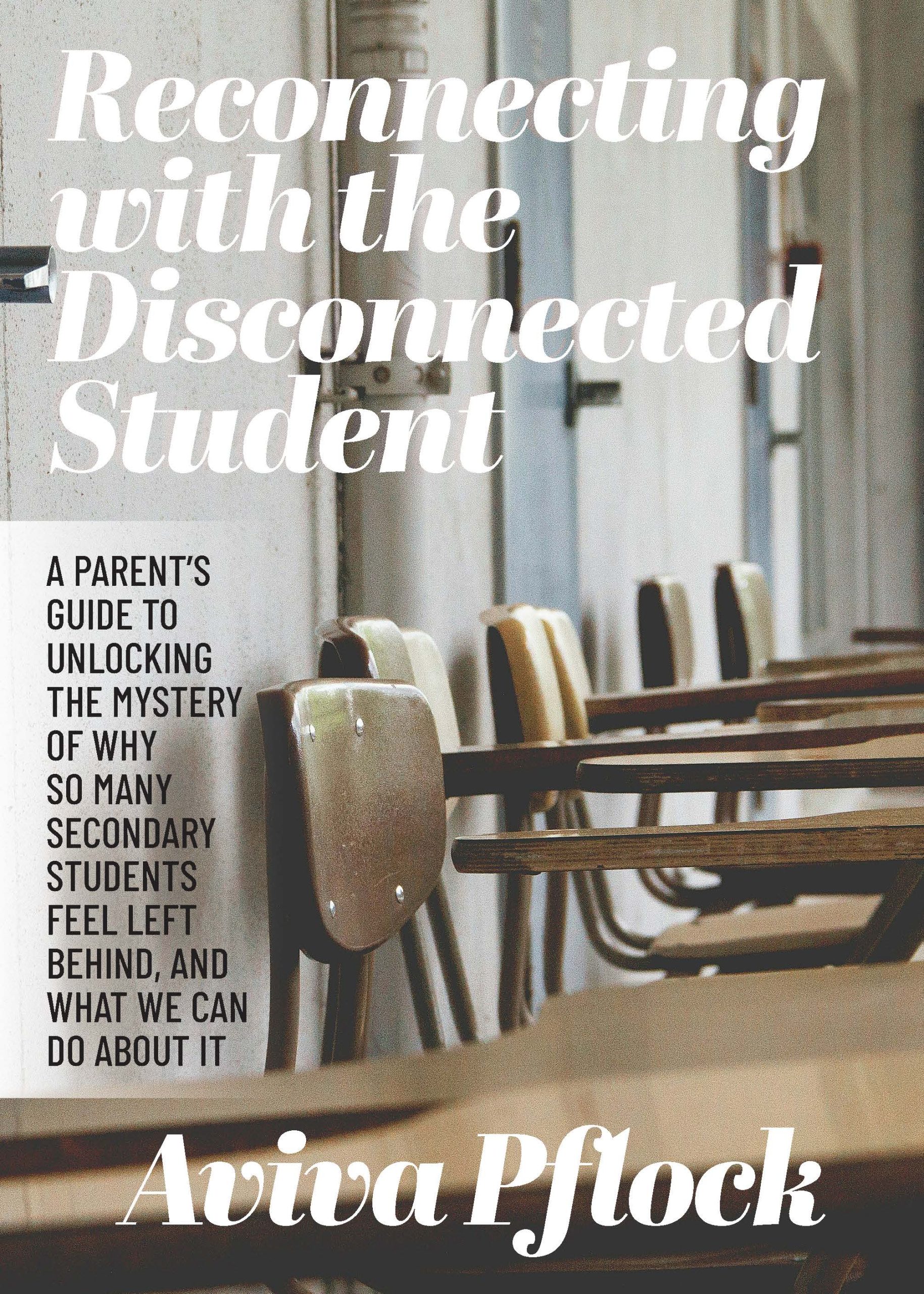
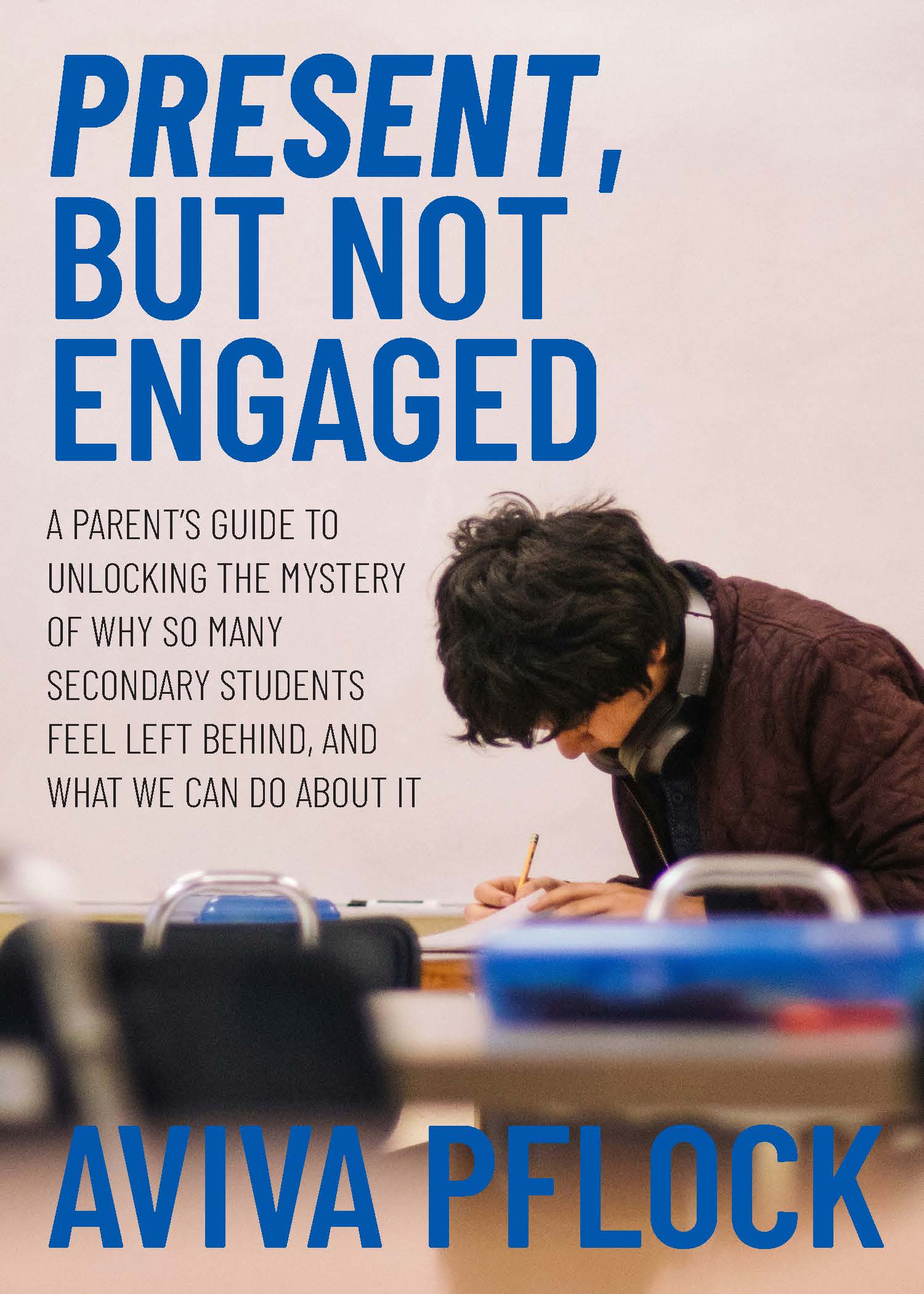
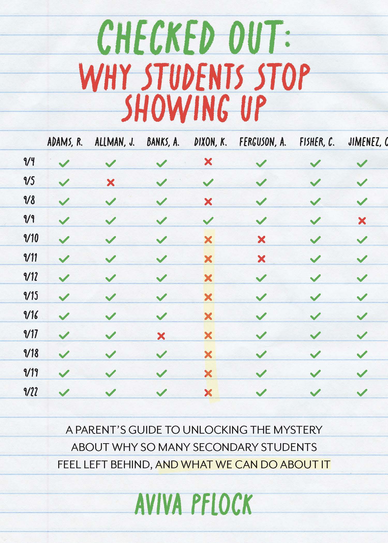
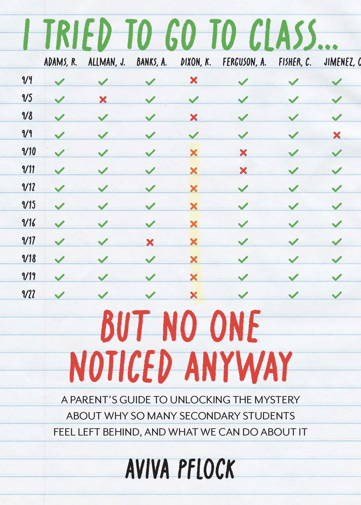
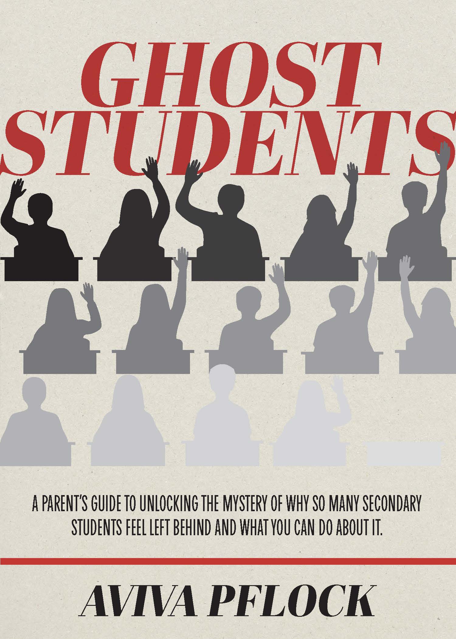
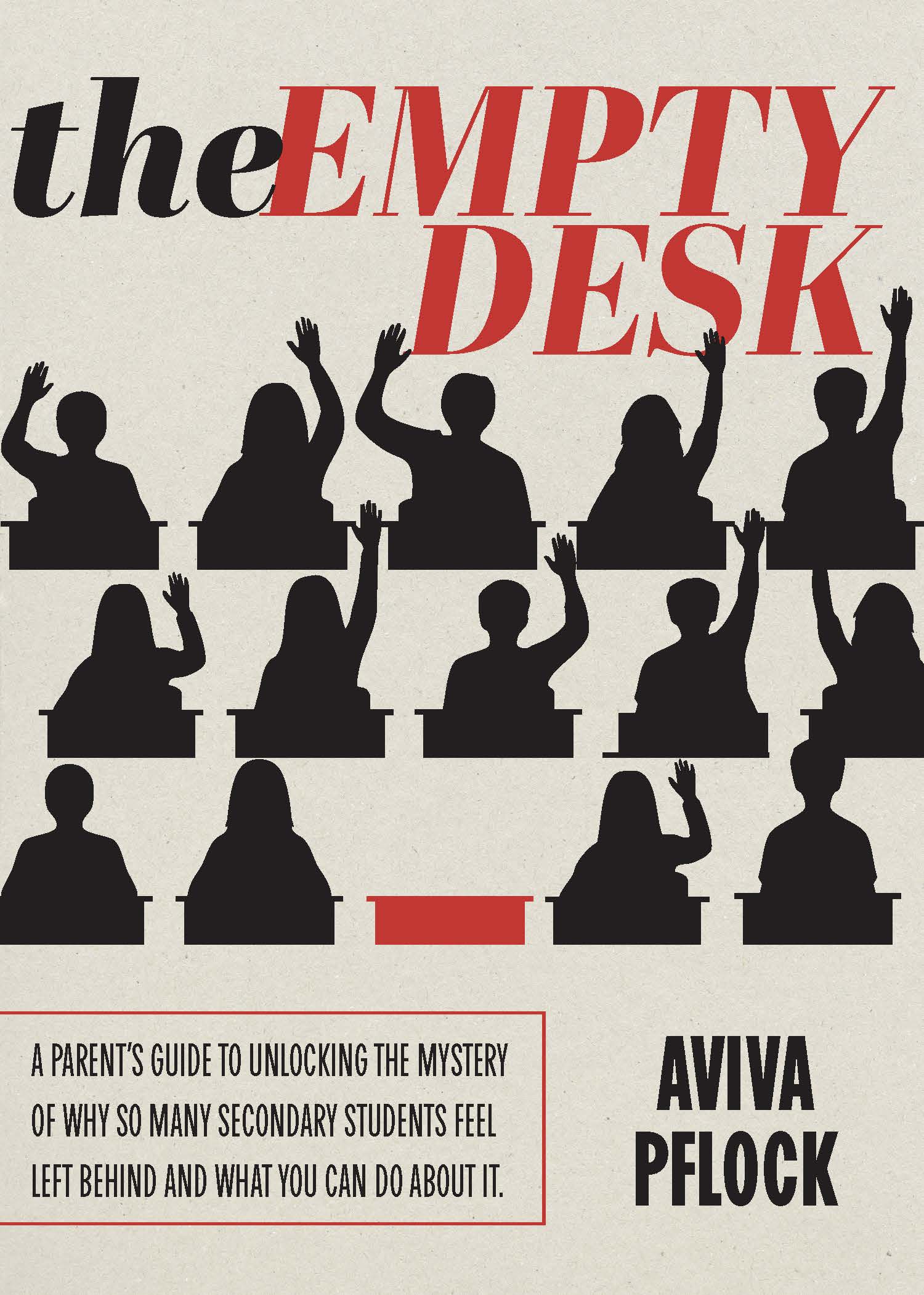
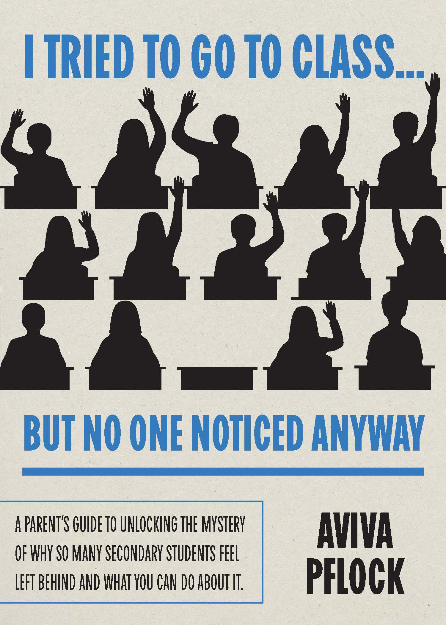
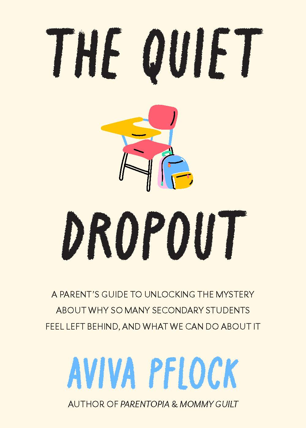
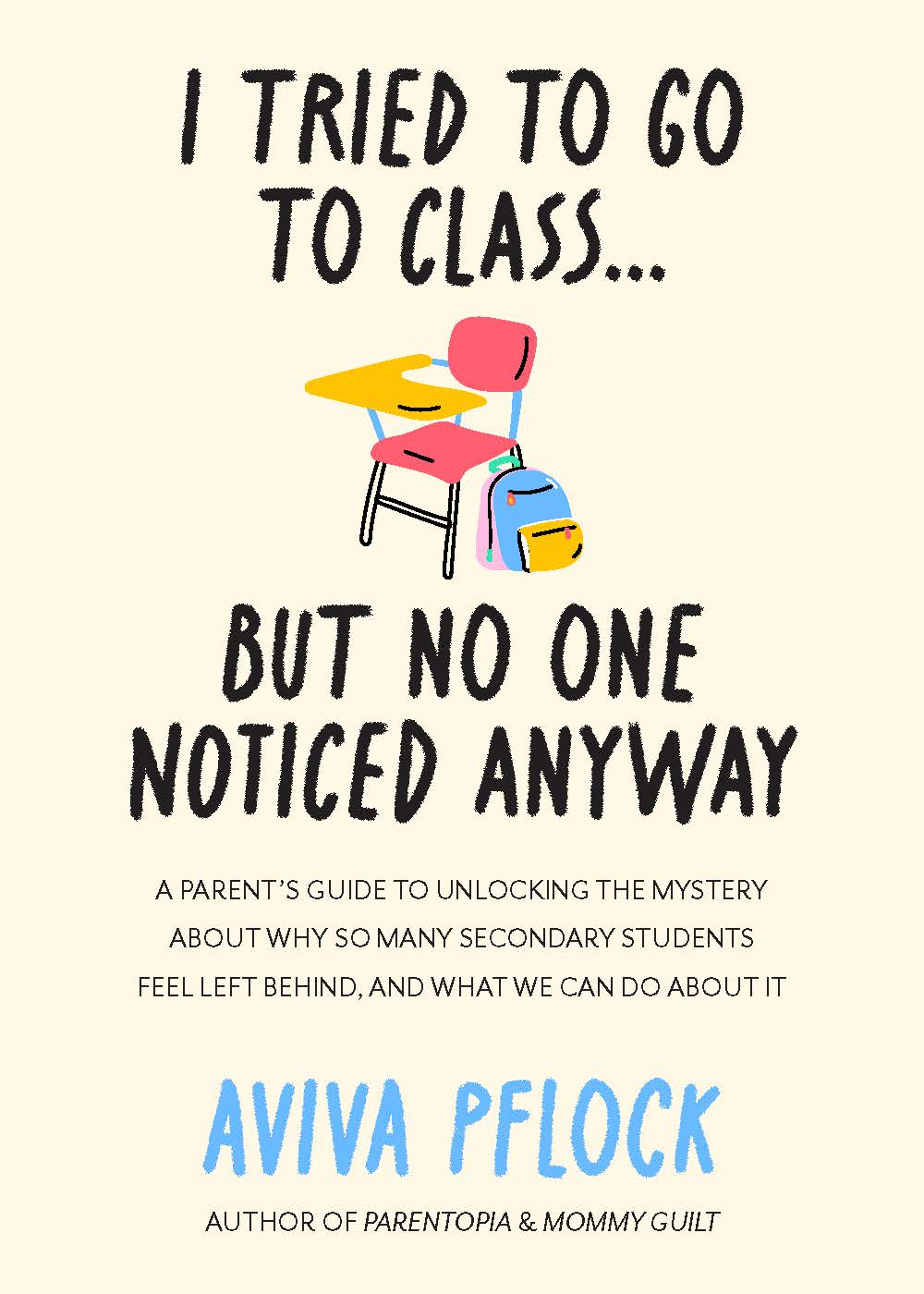
Book Covers: The Empty Desk

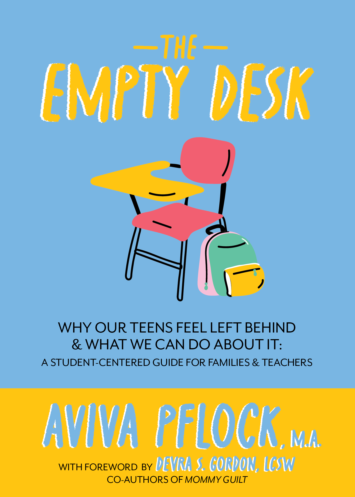
The Empty Desk Book Cover

Content property of Aviva Pflock; designed by Emily Hurt and posted here for design reference purposes only.

the task

Help a small, independent author decide on a book cover — and, for that matter — a book title. The left image is the final cover; the right is a carousel of options I created for the author to kick-start the process.

results

From an original idea dump including photos and illustrations, the client and I whittled down to the final cover: a bright-colored, illustrated desk that says it all.

Document Layout: Holiday Gift Guide

Holiday Gift Guide

Client: First Integrity Title Company

Postcard: Film on the Rocks

Postcard: Basketball Schedule

Postcard: Stock Show

Postcard: Hanukkah

Postcard: Chili Recipe

chili recipe

Content property of First Integrity Title Co.; example reproduced for design reference purposes only.

Postcard: Places to Give Back

Places to Give Back Front

Content property of First Integrity Title Co.; example reproduced for design reference purposes only.

Branding: Murphysboro, Illinois

Murphysboro IL logo
Murphysboro IL logo

Content property of McClure Engineering Co.; example reproduced for design reference purposes only.

the task

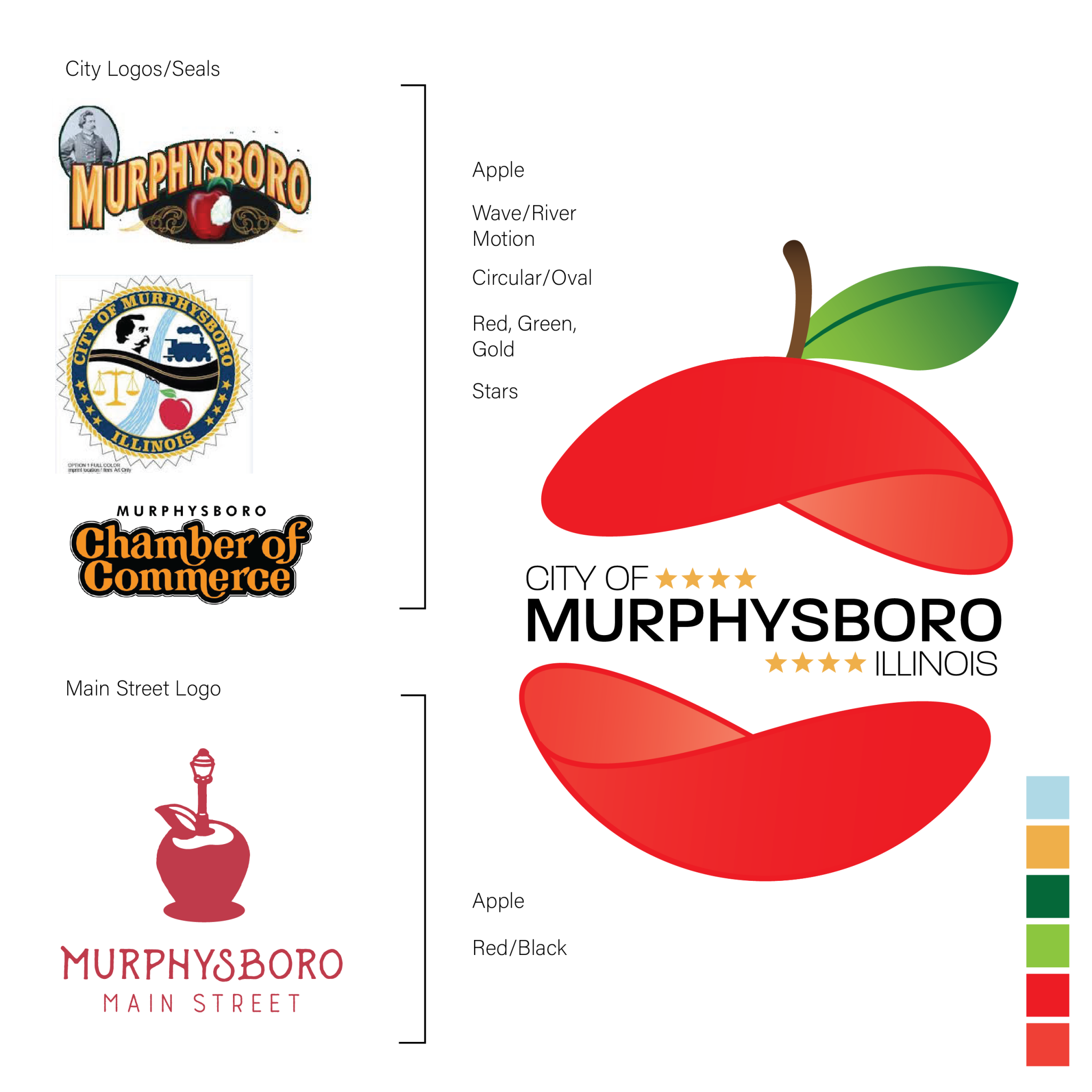
Combine two prior Murphysboro logos and the Chamber of Commerce logo while updating the iconography. The city requested that the new logo be in keeping with the Murphysboro Main Street logo, while still visually differentiable.

results

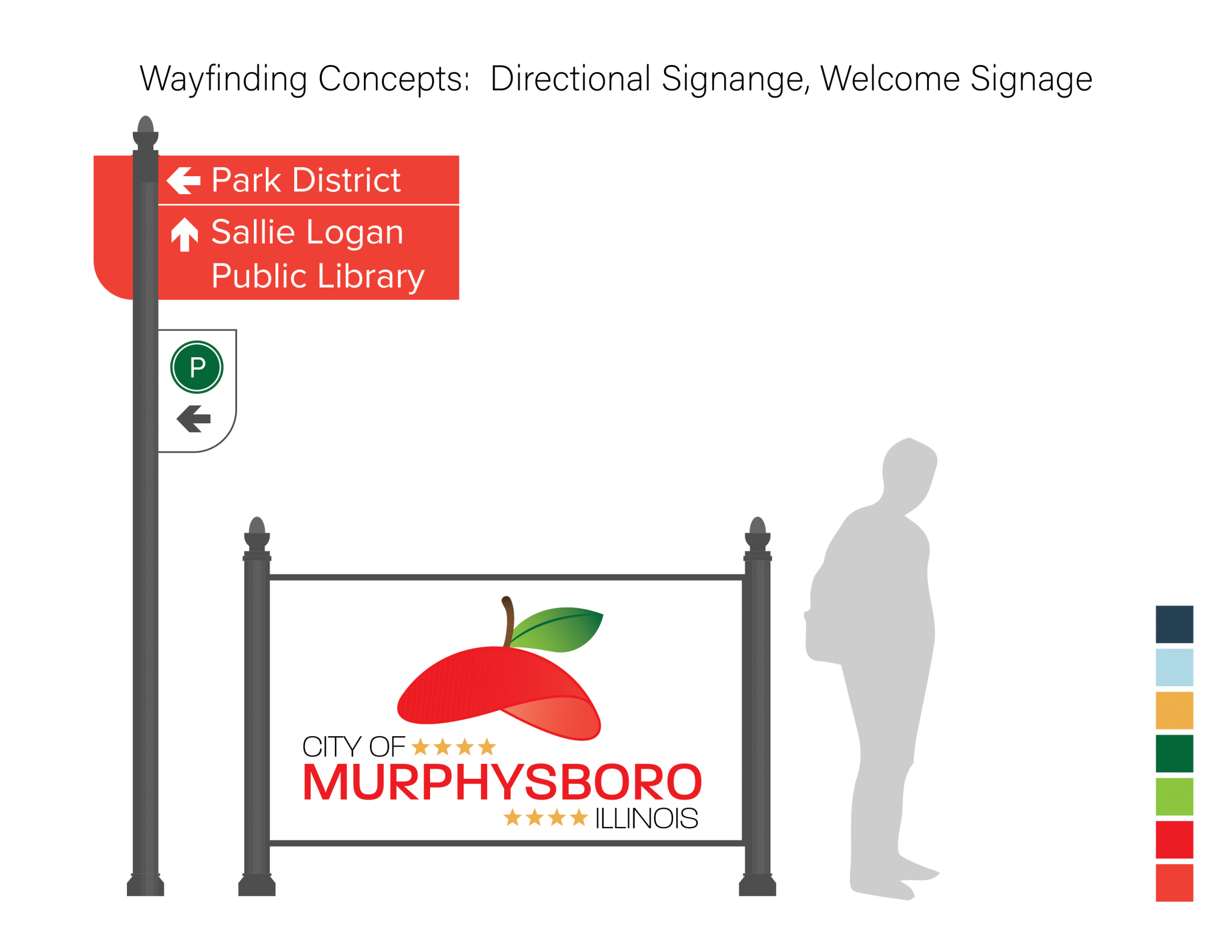
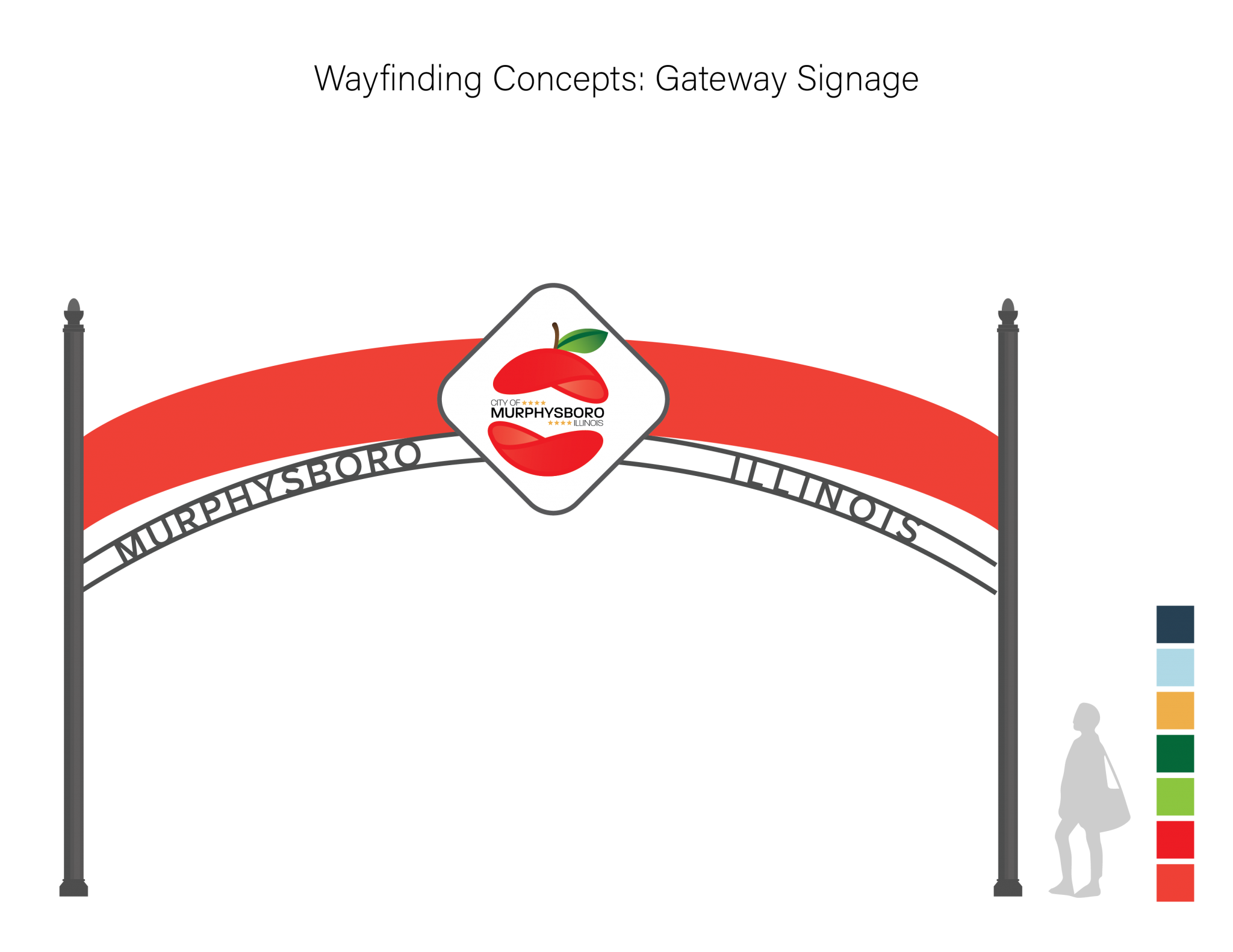
Building off the iconic apple that Murphysboro is associated with, I updated the iconography to a more modern look that incorporates dimension. A brighter red was chosen as the highlight of the color scheme to differentiate from the Main Street logo.

Branding: Pleasantville, Iowa

Pleasantville Branding

the task

This was part of a school assignment where I was asked to refresh an outdated logo, shown below.

City of Pleasantville Logo

results

The final logo is ultra-modern, in stark contrast with Pleasantville’s old logo. Fewer colors and a clean sans serif font bring it into the 21st century, while the illustration keeps the landscape and the water tower that was depicted in the original.